Comparative Analysis
Get answers to your basic Qlik questions fast. If you can’t see the information you’re looking for you can always reach out to your Account Manager. 😊
How do I use the Comparative Analysis sheets?
Use these sheets to compare different data sets. For example, before and after a Power Week, or comparing activity level between 2 different countries.
To make it easy to compare, the colours in the table match the same shades of blue at the top, where State 1 is the lighter blue and State 2 is the darker blue.
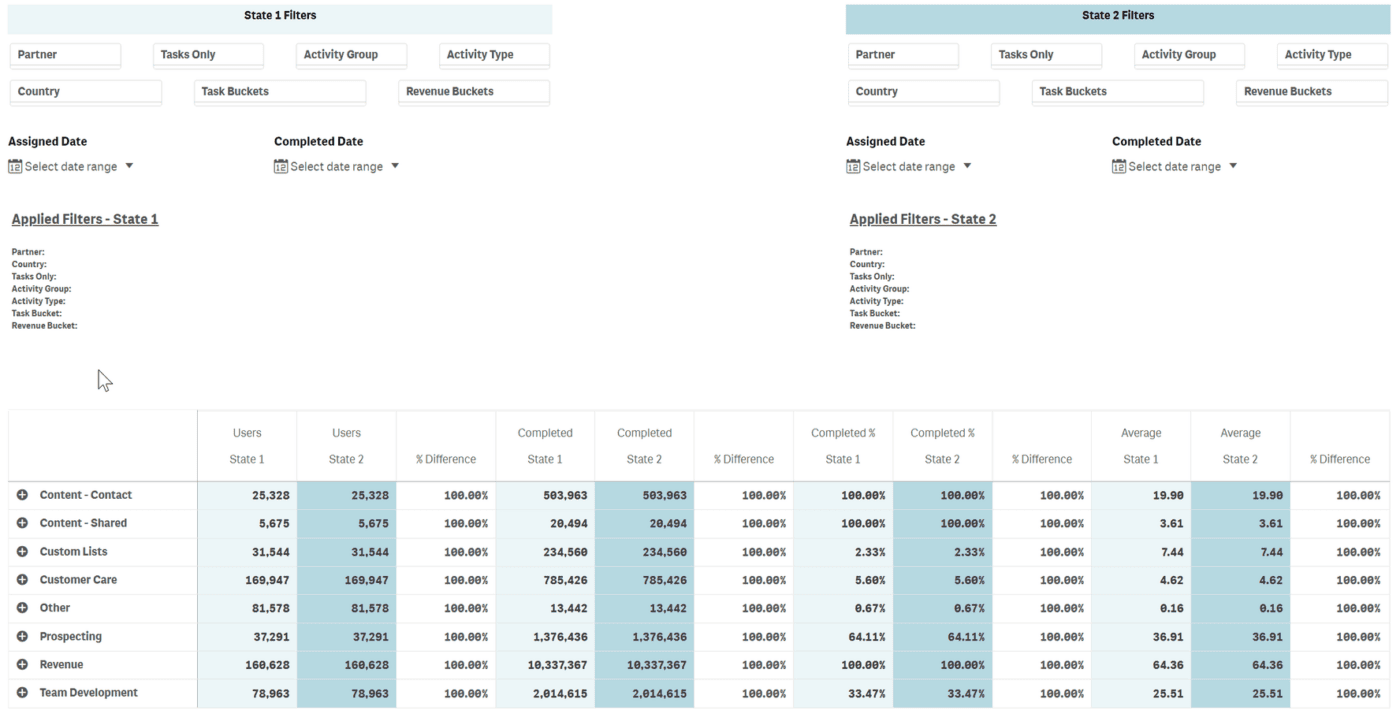
By setting State 1 and then State 2, you can compare all sorts of data. For example:
- Compare numbers of activities completed in Q1, vs Q2, or March vs April.
- Compare the number of logins or tasks completed before and after training sessions, or the number of tasks completed over a Power Week.
- Compare the volume of orders received by users who complete less than 15 tasks each month to those who complete more than 30.
- Compare the task completion rates for those earning more than $2500 and those earning less than $500.
- Compare the % of active users in one geographic region over another.
Video Example:
The following video walks through how to compare task completion between users who are making $500 / month or less and those who are making more $2500 in the first quarter of 2023.